Personalization has become a huge buzzword recently. And for good reason!
Countless studies have proven the effectiveness of personalization for online stores. For example, one study found that 80% of consumers are more likely to buy from a company that provides an individually-tailored experience.
In another survey, 70% of consumers say that how well a brand understands their individual needs impacts their loyalty.
It’s clear that consumers want personalized experiences. So why do eCommerce businesses fail to deliver?
The average eCommerce business owner stops at personalizing the first line of their emails to include a customer’s name. Most don’t even consider personalizing the on-site experience for visitors because they think it’s too complicated. But that’s a big (expensive) mistake!
Today, we’ll share 5 on-site personalization best practices that will lead to more satisfied customers and more revenue for your business.
Ready? Let’s go!
What is website personalization?
Before we get into the details, let’s clarify what website personalization is.
Website personalization is when you create unique on-site experiences for individual visitors based on their behavior, interests, and demographic characteristics.
This usually means offering tailored recommendations, dynamic content, and exclusive offers based on each customer’s profile and interests.
The goal of website personalization is to improve the customer experience, helping them discover the products they’re interested in more quickly and easily.
Making your website responsive to the needs of each visitor impacts both sales and customer retention.
What are the challenges of personalization?
There are three main reasons eCommerce store owners believe on-site personalization is difficult to achieve:
1. Lack of data
Not having enough data is the most common excuse for not personalizing. After all, isn’t data hard and/or expensive to collect?
This way of thinking is true—to a point. If you don’t have data, you can’t personalize. And collecting data can be hard…if you don’t use the right tools!
But if you’re equipped with the right tools, you don’t have to worry about gathering data or putting it to use.
A good personalization tool—like OptiMonk, Yieldify, or Dynamic Yield—automatically tracks the behavior of your visitors and gives you the data you need to target them. Easy peasy!
Plus, you likely already have a lot more data about your website visitors and customers than you think.
For example, the moment someone lands on your website, you already know:
- Their location
- The device they’re using
- Where they arrived from
- Which page they landed on
The more time they spend on your website, the more you’ll learn by keeping track of their browsing history and website searches!
2. Implementation difficulties
Implementing personalization can pose some challenges for eCommerce marketers since it requires a significant amount of technical know-how. It can be intimidating.
But, again, with the right technology stack, you can easily implement and run an on-site personalization strategy. Many platforms are really easy to use and don’t require any coding skills.
3. Speed issues
And finally, many people shy away from personalization because they worry it will affect website loading speed. The more you personalize your website, the more time it usually takes to load, right?
Well, not necessarily. You can use on-site messages that load after your main page content to personalize your website experience without slowing down your website!
5 tips to personalize the on-site experience for each visitor
Now that we’ve dispelled some common myths, let’s go over 5 tips (with examples) that will help you take advantage of personalization on your website to improve the user experience and drive more sales.
1. Cross-sell based on products added to cart
One of the best ways to personalize the on-site experience for your visitors is to recommend products based on what a customer has already added to their cart.
This is a type of cross-selling, so you’ll want to suggest items that pair well with what your customers have in their carts.
Let’s look at a few examples of personalized cross-selling.
When I add a sports bra to my cart on Gymshark’s website, they suggest leggings that complement my purchase.

With this strategy, you can recommend accessories that the customer might need with the product they’re planning to purchase, or just show related/similar products that the customer might also like.
This strategy encourages customers to purchase more and helps to increase the average order value.
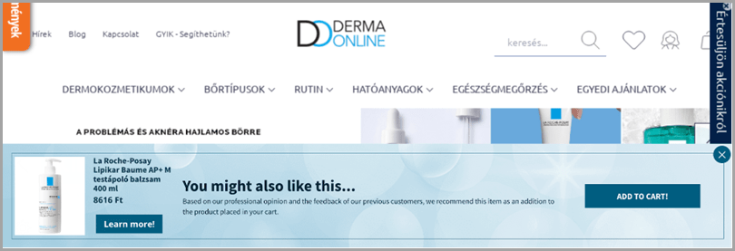
Check out how Derma Online implemented this strategy with a sticky bar promoting a product that’s relevant to what a visitor already has in their cart.

You could also trigger a popup immediately after a visitor adds something to their cart, like in the example below:

This strategy capitalizes on the moment of excitement someone feels when adding something to their cart, making it more likely that they’ll buy more.
2. Recover cart abandoners using personalized offers
Did you know that 7 out of 10 visitors who put an item in their shopping cart will leave your website without completing their purchase?
It’s crazy!
Luckily, you can prevent some of those lost sales with cart abandonment popups.
Cart abandonment popups are relatively popular among eCommerce stores, but there’s a strategy that only a few brands are taking advantage of; personalizing your cart abandonment offers based on cart value.
The greater the value of a customer’s cart, the bigger the discount you should offer your visitors.
Check out this exit-intent popup example from The Turmeric Co., where abandoners with a cart value between £25-79 are offered a 10% discount:

And those with a cart value greater than £79 get 20% off:

Another way of personalizing your cart abandonment popups is to differentiate between email subscribers and non-subscribers.
For example, here’s a cart abandonment popup you could display to your email subscribers:

And here’s the version you could show to visitors who haven’t subscribed to your email list yet:

As you can see, the second cart abandonment popup is designed to save conversions and capture email addresses.
3. Personalize offers for returning visitors
Welcoming back your returning visitors as soon as they land on your website is a nice touch. It helps make your website’s customer experience more convenient, especially if you remind them of the products they were browsing last time.
That’s exactly what Burberry does in this example:

Or, you could let them know about your new arrivals:

4. Personalize based on visitors’ location
As we mentioned at the beginning of this article, visitor location is a piece of data you automatically collect. So why not use it to personalize your content?
You can display country-specific messages about your shipping policies. Here’s a simple example from Lunya that’s just for Hungarian visitors:

But you can use this approach for any other regionally-specific offers or information you have. For example, you may be opening a new store and want to let local customers know about it.

5. Collect zero-party data and use that information
Quizzes are an increasingly popular way of collecting additional information about your visitors’ problems and interests. And customers love them because they’re a fun and engaging way of finding the perfect solutions for their problems.
Many big eCommerce websites provide quizzes. Sephora is one good example:

Quizzes are valuable because they enable visitors to tell you exactly what their problems are. It doesn’t get more direct than that, and this information helps you to better understand and segment your visitors, so you can put more personalized offers and product recommendations in front of them.
But it doesn’t end there! You can also use this information in your email marketing campaigns to send more personalized content to your subscribers.
For example, if you ask your visitors what their biggest skin concerns are, you can create different segments in your email marketing tool for people with acne problems, clogged pores, wrinkles, etc.

Wrapping up
Each of the five personalization tips we’ve discussed will help you improve the customer experience on your website. That amounts to making your online store easier to shop and reducing the time it takes each visitor to find the products they’re looking for.
This means more sales since customers won’t get confused, frustrated, or bored while looking through your website!
At this point, everyone knows that personalization is the future of eCommerce. These easy-to-implement strategies will ensure you don’t fall behind!
Guest Author: Nikolett Lorincz is a Digital Marketer at OptiMonk. She is obsessed with content marketing and loves creating educational content for eCommerce stores. OptiMonk is an on-site message toolkit that allows you to increase sales & drive conversions with laser-targeted, personalized messages.
The post How to Master On-Site Personalization (With 13 Examples) appeared first on Jeffbullas's Blog.
* This article was originally published here

No comments:
Post a Comment