
Ever felt invisible? We share the world with 8 billion other people, and it’s easy to feel like you’re fading into the background in the hubbub of the city. Likewise, every business shares its industry with a huge number of competitors in a crowded market.
Sure, you might be more affordable, reliable, or innovative than your competitors, but your customers don’t know that for sure until they’ve tried you. Before that happens, you have to stand out from the crowd.
The way to do that is with clear brand identity design. A tight brand identity communicates your difference to your customers, sets you apart from your competitors, and makes you memorable to anyone who has used your products or services already.
Brand identity design is the sum of every visual and tonal branding choice your business makes. When it’s done well, it creates a coherent identity that gives you a relationship with customers that transcends the transactional.
The truth is, if you want to build a business in the 2020s, you need to build a brand. So let’s dive into brand identity design.
What is brand identity?
When you shop with the businesses and brands you love, you feel something.
IKEA doesn’t just make furniture, it furnishes homes with thriving families crafting their individual lives inside. Louis Vuitton doesn’t just sell bags, they sell luxury, and anyone buying a Louis Vuitton bag gets to feel, for a moment, a sense of that luxury in their lives.
This is brand identity: it’s how your customers, and potential customers, view your brand. It encompasses your mission, your values, and your brand tone.
Brand identity is built through various channels and strengthened in every interaction with your customers, but it is communicated in the first instance through the very first things your customers notice about your brand: your name, your logo, your tagline, and the wider visual elements of your brand.
Get the elements of brand identity design right, and you’re off to a strong start.
Why is brand identity important?
According to research published by the Economist, ‘brand’ creates around 30% of the value of companies in the S&P 500. A strong brand identity has a big impact on your bottom line.
Every successful brand has carefully crafted an identity so that its customers know exactly what the brand stands for. A brand identity connects your products or services with the lifestyle of your audience, and customers can have a meaningful experience when they shop with you.
In competitive markets, a strong brand identity ensures you stand out from your competitors and plays an important role in both reaching new customers and ensuring the loyalty of existing ones.
It takes work to create and maintain a brand identity, and that’s where brand identity design comes in. Brand identity design is the process of crafting your brand identity through your brand’s style choices, marketing and communication, and customer service.
A quick case study in brand identity design: The Netflix brand
Examine any one of the products and services you regularly use and you’ll see the elements of brand identity.
Take Netflix, used every day by millions of people around the world, and a quick analysis reveals:
- A great, memorable name with a modern, disruptive feel and a clear link to the product.
- An iconic logo, with arcing text reminiscent of the cinema experience.
- A distinctive black and red color.
- Minimalist typography choices that emphasize ease of use.
- A quirky brand tone on social media.
Did Netflix grow into an online streaming giant by accident? No, they used clever brand identity design to do it.
Everything is considered, creating a consistent brand experience every time you open the Netflix app. In fact, they even use sound as part of their brand identity. You think of Netflix as soon as you hear that “badum”, right? Even the souped-up movie theater version.
The bare bones of brand identity design are everywhere, once you open your eyes to them. Let’s take a closer look.
How to start developing your brand identity
To design a brand identity that fits your business and will resonate with your target audience, you first need to ask (and answer) a few questions.
1. What is my brand’s purpose?
Everyone launching a business has a big idea, and every idea has a story behind it. Identify the unique value proposition that your business offers its audience: what has driven you to start your business and what do you have that your competitors lack?
Your purpose is the foundation of your brand identity, and as you develop your brand identity design you’ll be able to communicate your mission to your audience at every step.
2. Who is my audience and what do they want?
Brand identity design isn’t just about you: it’s about building a relationship with your customers. Building a strong brand identity is a dialogue, so you have to understand who you’re talking to.
Conduct market research to discover exactly who your customers are, what they dream about, and what they want to hear from you.
At the same time, perform some industry analysis to understand your competitors’ brand-building projects. Ask yourself what they’re getting right and what they’re missing. Spotting key trends in your industry can give you some shortcuts in communicating your purpose with your audience.
3. What core tone will work for my brand?
Your brand tone is like the personality of your brand. It should communicate your purpose and values to your audience, in a way they’ll be receptive to based on your research.
Luxury brands communicate exclusivity and prestige through their brand tone, while disruptive brands might be cheeky and creative.
Here are some brand tone examples:
- Cutting-edge and innovative
- Quirky and playful
- Warm and homely
Your purpose, your audience, and your brand tone will come together to define your brand. Now it’s time to communicate your brand identity to your audience: let’s take a look at brand identity design.
What are the elements of brand identity design?
Once you understand your brand identity, you can begin brand identity design. Careful curation of the imagery and style choices associated with your branding will enhance your brand identity, reinforce your values, and fix your brand in the hearts and minds of your customers.
1. Craft your logo
Your logo is the launching point for brand identity design. It will be the most consistent image accompanying your products and can provide a foundation for further style choices, like color and font choice.
A good logo must always be simple and memorable, but that doesn’t mean it’s simple to design one. Your logo needs to evoke your brand’s purpose and values and be versatile enough to use across video and still image marketing marketing material.
Prioritize simple, block colors and clean lines to create an uncluttered logo that consumers can grasp at a glance. Nike’s iconic swoosh symbolizes movement and sports, while Google’s utilitarian logo is paired with a splash of color. Both create timeless imagery to accompany the brand’s further design choices.
On a budget? Check out our list of AI logo generators.
2. Pick your color palette
You should have a consistent color palette to accompany your brand’s communications. As well as being functional (a predominantly black logo will fail to stand out against a dark color palette) your choice of colors will also stir your customers’ emotions, so choose the right ones.
Read up on the psychology of color to understand how your color palette will influence your customers and relate to your brand tone. If you want to create an impression of security and trust, lean on blue tones while orange is connected with creativity and confidence.
Mailchimp has opted for a ubiquitous cavendish yellow for its brand identity design, a color that’s memorable and energetic. And we can see how to color choices of the fashion house and perfume brand Christian Dior emphasize luxury
3. Choose your typography
The next ingredient in brand identity design is your typography, and the fonts you use can say a lot about you.
Burberry’s new serif font has a classy and timeless feel, while simple fonts like those across Google’s branding are friendly and appealing. You could even design a new font based on sketches or handwriting if creativity and personality are at the heart of your brand identity.
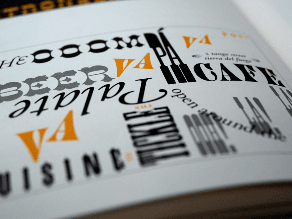
Your typography choices should align with your logo and color palette, and they should always facilitate understanding rather than confusion in your customers. Mixing typography can create visually appealing contrasts, but avoid overly elaborate typography that’s hard for customers to interpret.
4. Build your visual language
We’re visual creatures, devoting almost half our brain processing power to what we see around us. That means a visual language, one integrating icons and graphics, is a powerful addition to your brand
Throughout your branding, ask yourself if you could say it with a picture and if so, what kind of imagery would appeal to your customers and remain consistent with your brand tone.
Google’s strict guidelines for imagery and icons create an intuitive visual language for customers. For your own, you might prefer artistic sketches that appeal to your customers’ creative side or something photo-realistic over computer-drawn graphics.
5. Keep it consistent
While there are many important choices within brand identity design, the choices you make should be fixed. It’s fundamental to the functioning of your brand that your design choices are consistent across your website, product design, social media, email newsletters and anywhere else you have the opportunity to use them.
Consistency is professional and it will reinforce trust in your brand. But more importantly, it helps get the message across and builds a coherent identity that customers begin to understand implicitly. Eventually, it might take nothing more than a splash of your iconic color to remind your customers of the values that your brand is founded on.
Building a brand style guide alongside your brand identity design can help keep your brand consistent. Your style guide can document your chosen color palette, typography, and visual language, it can quickly onboard new hires who are learning about your brand tone and it can streamline the process when you hire creatives for new campaigns.
A brand style guide can even outline the tone your employees take when talking to customers, the arrangement of shop floor displays, and the rules for sonic branding. Brand identity design begins with your name, logo, and the immediate visual components of your brand, but the strongest brands curate every instance of user experience to align with these fundamental elements.
Brand identity design examples
Think about any of the brands you love, and you’ll realize that they have a coherent strategy around brand identity design. The most successful examples of brand identity design aren’t obvious: these brands have created a brand identity that feels organic, and customers connect with these brands naturally.
However, it doesn’t happen by accident. Every brand, from Christian Dior to Mailchimp, has made key decisions about every aspect of their brand design. Here are some brand identity design examples to draw inspiration from.
IKEA
IKEA’s powerful branding gives them a strong top-of-mind awareness. The iconic color scheme of their logo was inspired by their Swedish origins, but as well as being a patriotic nod to their homeland, it also effectively emphasizes the clean design and practical functionality they’re known for.
Even the name ‘IKEA’, in block capitals, combines pre-eminent practicality with a stylish and exotic twist.
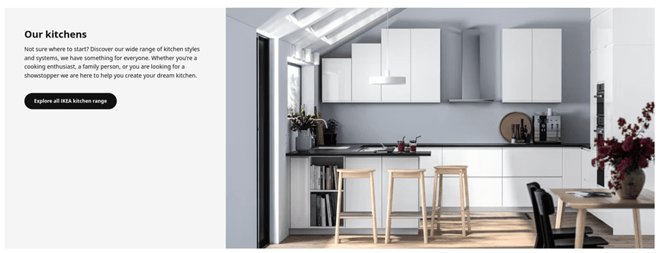
Across IKEA’s branding, they use clean, uncluttered imagery, real photography over graphics, and prioritize neutral color palettes.
This combination creates space for IKEA’s customers to project their desires onto their products, to the extent that the whole process of shopping at IKEA is one of self-actualization.
Oatly
Oat milk brand Oatly follows well-established naming trends, with the -ly suffix immediately hinting that this is a disruptive brand outside the establishment.
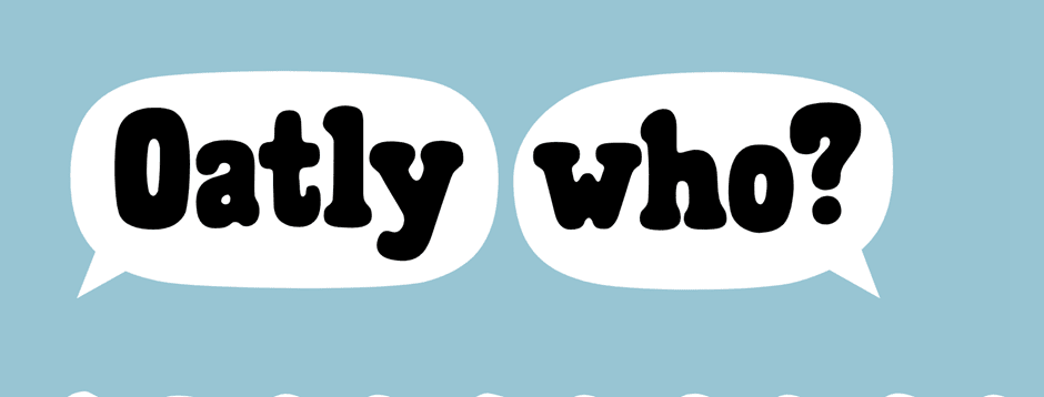
They have created a quirky brand identity through their design choices, using subtly unaligned custom fonts to create an invitingly unprofessional feeling, and have perfected a warm, casual brand tone packed with offbeat humor.
Importantly, this humor is consistent across their social media, website, and product packaging to create a cohesive identity.
Oatly is a friendly brand integrating itself into the lifestyle of its users. These design choices might appeal to vegetarians and vegans already looking for alternative milk products, but by creating a wholly unpolitical brand identity, they effectively target young consumers from all walks of life.
Oh, and does anybody else see a cow in the black-and-white ‘Oatly Who?’ design above? Talk about subliminal.
Final thoughts
In a competitive business environment, the strength of your idea alone doesn’t guarantee success. You also need to communicate that idea to your customers, in a way that meaningfully connects your business with their lifestyle and aspirations.
That’s why building a brand identity is essential, and understanding brand identity design lets you optimize every detail of your brand to send the right message.
From a timeless logo, creative typography and a color palette that leverages your customers’ psychology, brand identity design gives you the tools to build a powerful brand. Ready to get started? Check out our Brand Identity Design service at Squadhelp.
Guest Author: Lotte Reford is Communications Lead for Squadhelp.com, an innovative naming & branding platform with more than 40,000 customers globally, from the smallest startups to corporations like Nestle, Philips, Hilton, and Pepsi.
The post What is Brand Identity Design? How to Create an Unforgettable Brand appeared first on Jeffbullas's Blog.
* This article was originally published here


No comments:
Post a Comment